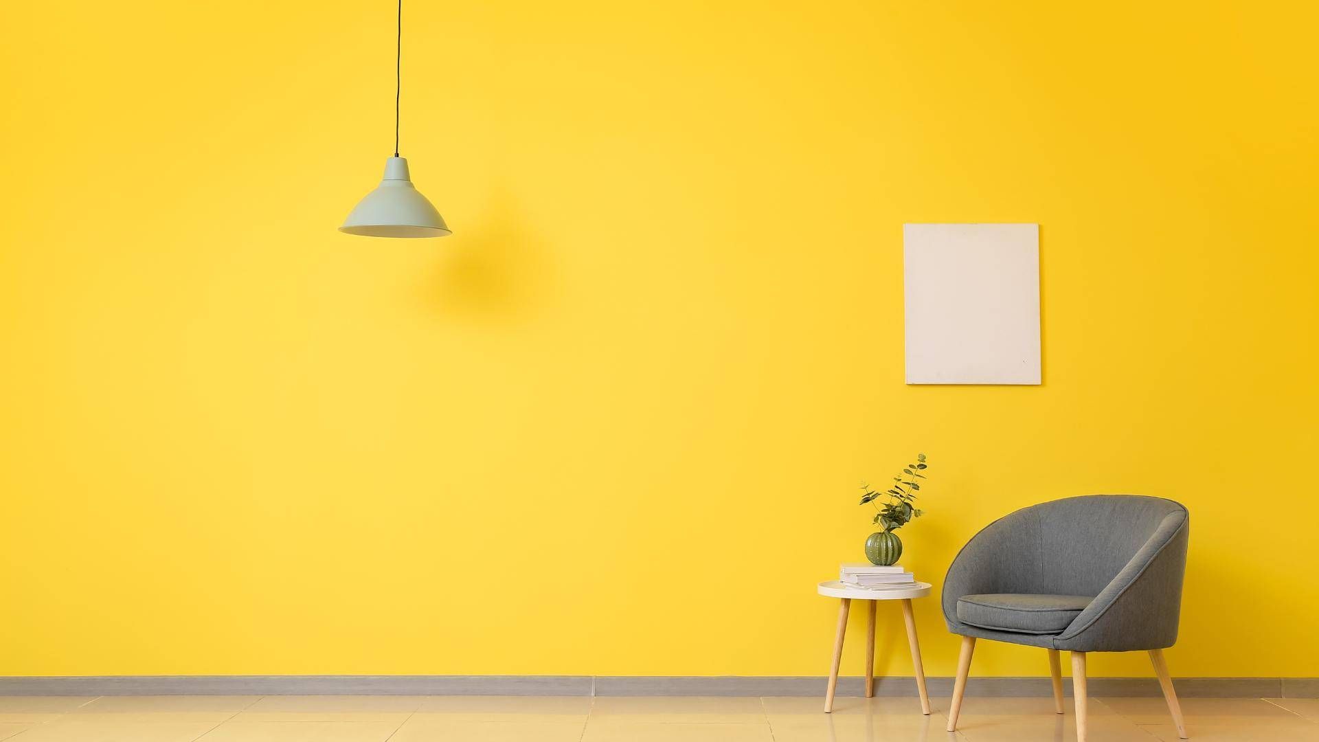
The colour experts have spoken and the Dulux Colour of the Year 2025 has been announced. True Joy is what we should be filling our homes with, a warm and sunny yellow with a sumptuous, golden tint.
True Joy is full of pigment so it provides a real splash of colour wherever it is used, with a natural luminosity that exudes energy. Neither a pastel nor a dark hue, True Joy sits in the middle of the saturation spectrum.
While an entire room painted in True Joy is a bold choice, it can work in the right settings - especially in spaces with an abundance of light, house plants and plenty of natural materials to provide a muffling, muted foil.
A hint of yellow
More palatable is using True Joy as an accent colour. It pairs especially well with nature-inspired neutrals, think shades of wheat, barley, mushroom and pebble. Use a pale colour on the walls and add flashes of yellow by painting a mantelpiece, a window sill or a set of shelves in the Colour of the Year.
Colour combinations to try
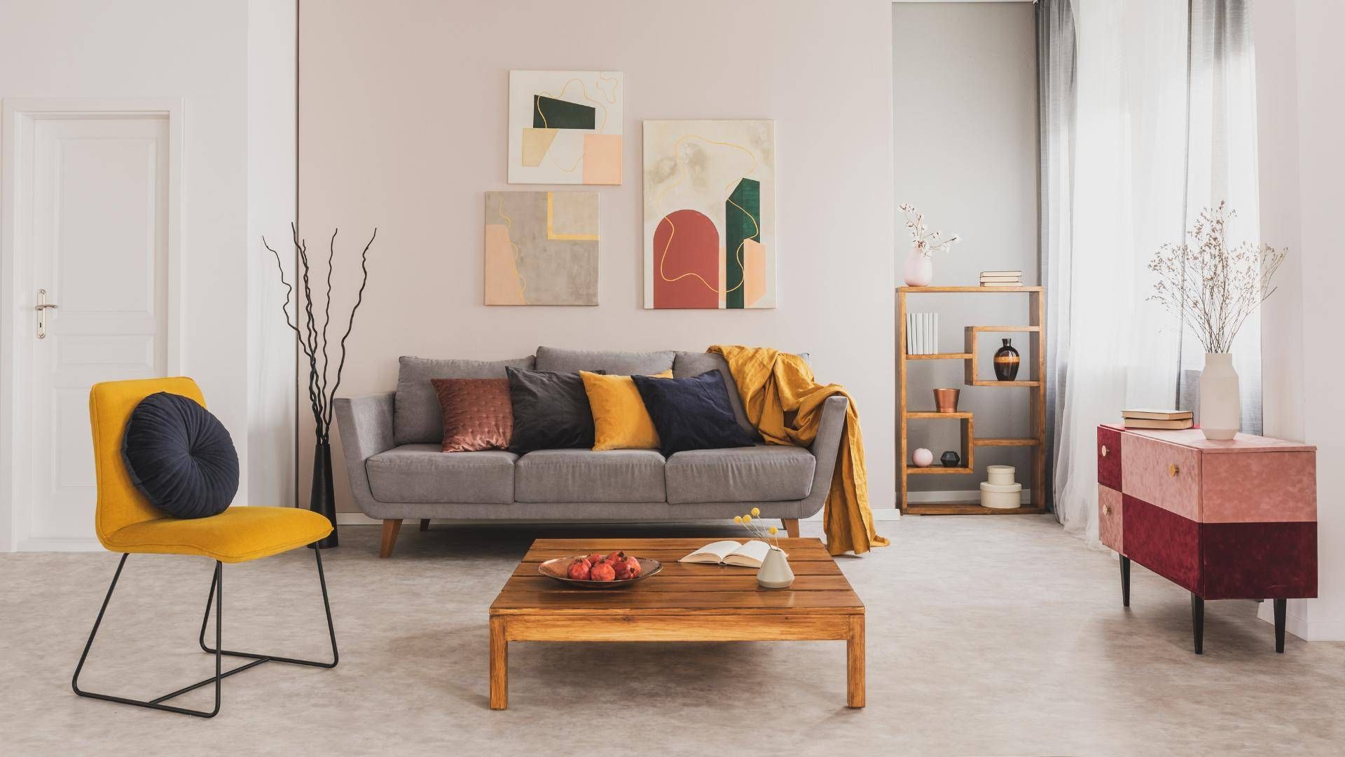
Surprisingly, True Joy is a natural partner for very dark colours. Its golden tones complement navy blue incredibly well, especially when the two shades manifest as velvet fabrics, metallic finishes and matt paint.
True Joy, soft white and chalky black also make a good colour grouping. As True Joy is a soft, earthy shade and not an acid or chartreuse yellow, it can come across as a very sophisticated highlight in an otherwise monochrome scheme.
Perhaps the easiest way to incorporate True Joy is to use it in tandem with wood. A splash of yellow above a dark sideboard (mango, teak and mahogany are good wood types) is a warm, rich combination. Conversely, a light, Scandi aesthetic can be achieved when hints of True Joy are combined with ash, beech or light oak flooring.
If True Joy is a colour that you find hard to work with, consider going lighter or darker for extra versatility.
Darker alternatives to True Joy
For times when only intensely rich and opulent shades will do, opt for darker yellows that echo the shades of sand and ochre. Apply liberally in studies, dining rooms and snugs, and combine with the soft, diffused light from table lamps and gold, gilded finishes. Try Farrow & Ball’s India Yellow, Paint & Paper Library’s Muga, Little Greene’s Bassoon or Crown’s Overjoyed.
Lighter alternatives to True Joy
If you want to harness the uplifting, energising properties of yellow over a bigger expanse, a lighter shade than True Joy will impart a zestier, fresher vibe. Shades including Farrow & Ball’s Citron, Paint & Paper Library’s Brimstone, Little Greene’s Giallo and Crown’s Sunrise work well in spaces you want to feel lighter and brighter, such as kitchens and hallways.
If we have inspired you to get decorating, come and chat to us. Perhaps now is the time to move on from your current property and find a new home that you can decorate to your tastes?
Share this article
More Articles
Sign up for our newsletter
Subscribe to receive the latest property market information to your inbox, full of market knowledge and tips for your home.
You may unsubscribe at any time. See our Privacy Policy.


